Bar Chart vs Histogram: Key Differences and When to Use Them

Introduction
Data visualization bar chart plays a critical role in simplifying complex datasets, enabling quick understanding and analysis. Whether you’re analyzing business performance or scientific research, choosing the right visualization tool is essential to presenting data in an easy-to-digest format. Two common forms of data visualization are bar charts and histograms. While they may seem similar at first glance, they serve different purposes and display data in distinct ways. Understanding the difference between a bar chart vs histogram and a histogram is key to using them effectively in your data analysis.
In this article, we will break down the differences between bar charts and histograms, explore when each should be used, and highlight the key advantages of each chart type. By the end, you’ll have a solid understanding of which chart to choose based on your specific data visualization needs.
What is a Bar Chart?
A bar chart is a graphical representation of data where rectangular bars of different lengths represent data values. It is commonly used to display categorical data, which refers to variables that are grouped into distinct categories. The height or length of each bar corresponds to the frequency or value of each category. Bar charts can be oriented either vertically or horizontally, with the categories typically listed on the x-axis (horizontal axis), and the values represented on the y-axis (vertical axis).
Bar charts are ideal for comparing different categories, making it easy to visualize the differences between them. For example, you could use a bar chart to compare sales performance across various product categories, such as electronics, clothing, and furniture. This form of visualization allows for easy comparison at a glance, helping decision-makers identify trends, gaps, or areas needing improvement. Another advantage of bar charts is their versatility; they can be used with both small and large datasets, making them a popular choice across various industries.
One key benefit of bar charts is their clarity and simplicity. They work well for data that is discrete and not continuous. For instance, a survey result showing preferences for different types of pizza toppings can be effectively visualized using a bar chart. Furthermore, bar charts are easy to create and interpret, even for beginners. They are an essential tool for presenting data in a visually accessible way, which is why they are frequently used in business and academic presentations.
What is a Histogram?

A histogram is another type of data visualization, but it serves a different purpose. Unlike a bar chart, which displays categorical data, a histogram is used to represent the distribution of continuous data over a set of intervals. This is particularly useful for showing the frequency of data points within certain ranges, such as ages, heights, or income levels. Histograms divide the data into “bins” or “intervals,” and the height of each bar represents the frequency or count of data points that fall within that range.
For example, if you’re analyzing the distribution of test scores in a class, a histogram might show how many students fall within certain score ranges, such as 0-10, 11-20, 21-30, and so on. By grouping data into intervals, histograms make it easy to observe patterns, such as whether data is evenly distributed or if there are outliers or clusters in specific ranges bar chart vs histogram. This is especially useful in understanding the shape and spread of data.
One major benefit of histograms is their ability to show the distribution of data points over a continuous range. This is particularly helpful when analyzing large datasets with numerical values. Histograms can reveal insights into the overall structure of data, helping analysts understand whether the data follows a normal distribution or if there are skewed or bimodal patterns. Histograms are commonly used in scientific research, quality control, and statistical analysis, where understanding the distribution of data is crucial for accurate conclusions and predictions.
Key Differences Between Bar Charts and Histograms
While both bar charts and histograms involve bars, the key differences lie in how they represent data. The most fundamental distinction is that bar charts are used for categorical data, while histograms are used for continuous data. A bar chart represents distinct, separate categories, such as product types or survey responses. In contrast, a histogram groups data into intervals, showing the frequency of data points within each range.
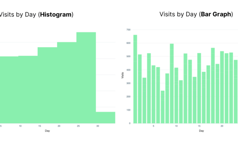
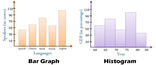
Another noticeable difference is the spacing between bars. In a bar chart, there is typically a gap between the bars to indicate that each bar represents a different category. On the other hand, histograms have bars that touch each other, as the data being represented is continuous, and each bin represents a range of values.
The data grouping is also different. In a bar chart, there is no need to group data points, as each category is represented independently. Histograms, however, require data to be divided into intervals or bins, which means the data needs to be grouped before it can be visualized. This grouping helps in summarizing large datasets and allows for a clearer understanding of the data’s distribution.
Lastly, while bar charts use one axis for categories and the other for frequency or values, histograms focus on how the data is distributed across intervals, which is represented on the x-axis. This makes histograms particularly effective for showing patterns, trends, and skewness in continuous data.
When to Use a Bar Chart vs. a Histogram
Choosing between a bar chart and a histogram depends largely on the type of data you are working with. A bar chart is ideal when you need to compare distinct categories, such as comparing sales revenue across different stores, product types, or customer demographics. Bar charts are perfect for showing categorical comparisons where the data is non-numeric or when each data point is independent.
On the other hand, histograms are better suited for analyzing continuous data, particularly when you want to observe the distribution of data points. If you’re working with data that represents ranges, such as the distribution of employee salaries or test scores, a histogram would be the more appropriate choice. Histograms provide valuable insights into the frequency of data within certain ranges, making them particularly useful for statistical analysis.
It is essential to use the right visualization tool to avoid misrepresenting your data. For instance, using a bar chart for continuous data might create confusion, as the chart would not accurately reflect the data’s distribution. Similarly, using a histogram for categorical data would obscure the meaningful comparisons between the different categories. Always consider the nature of your data before choosing between these two types of visualizations.
Tools for Creating Bar Charts and Histograms
Creating bar charts and histograms has never been easier thanks to a variety of tools available in the market. Popular software options include Microsoft Excel, Google Sheets, Tableau, and various Python libraries such as Matplotlib and Seaborn. These tools offer straightforward features that allow users to quickly generate both bar charts and histograms, making them accessible to beginners and experts alike.
For instance, in Excel, creating a bar chart or histogram is as simple as selecting the data, choosing the appropriate chart type, and customizing the design. In Python, users can leverage libraries like Matplotlib to generate more customized visualizations with advanced features, such as adding titles, legends, and adjusting the axis scale. For large datasets, Tableau offers powerful visualization capabilities, enabling users to create dynamic charts that update in real time.
When using any of these tools, it is essential to focus on the clarity of your visualization. Avoid cluttering the chart with too many categories or bins. Instead, focus on the most important data points to ensure that your audience can quickly interpret the information presented.
Conclusion
In conclusion, both bar charts and histograms are valuable tools for visualizing data, but they serve different purposes. Bar charts are ideal for comparing distinct categories, while histograms are perfect for showing the distribution of continuous data. Understanding these differences and knowing when to use each type of chart will enable you to present your data in the most effective way possible. By choosing the right tool for the job, you ensure that your data is represented clearly and accurately, making it easier to draw meaningful insights.
FAQs
What are the main differences between a bar chart and a histogram?
The main difference is that bar charts represent categorical data, while histograms represent continuous data. Bar charts have gaps between bars, while histograms do not.
Can I use a histogram to represent categorical data?
No, histograms are used for continuous data, while bar charts are meant for categorical data. Using a histogram for categorical data would not provide accurate insights.
Why are there gaps between bars in a bar chart but not in a histogram?
In bar charts, the bars are separated to represent distinct categories. In histograms, the bars are connected because they represent continuous data and are grouped into intervals.
What are some alternatives to bar charts and histograms for data visualization?
Other popular alternatives include pie charts, line charts, scatter plots, and area charts, each suited for different types of data and analysis.
Which chart should I use for survey data analysis?
For survey data, use a bar chart to represent categorical responses, such as preferences or choices, while a histogram is better for analyzing the distribution of numerical responses.
Are there any tools that automatically suggest the right chart for my data?
Yes, tools like Tableau and Power BI can analyze your data and recommend the most suitable chart type based on the dataset’s structure.
You May Also Read:https://workuptime.co.uk/

